Posts

Mid Modern Blog

Image
Campbell's Soup Cans by Andy Warhol Campbell's Soup Cans was made by Andy Warhol between 1961-1962 in Andy Warhol's studio in Manhattan. Andy Warhol inspired awe with these paintings as he created 32 paintings of different Campbell soups, all on separate canvases. Andy Warhol hired someone to take various pictures of the soup cans as he then projected the photos onto the canvas, drew the edges, and filled in the outlines with paint. These paintings are an example of pop art which was popular in the mid modern art era. Warhol was considered to be the beginning of pop art which was a movement that brought working-class American subjects into fine art. The elements are shown in this painting through repetition, flat color, and uniformity. The repeated image of the Campbell's soup can in multiple canvases emphasize the idea of mass production and consumerism. Each can is nearly identical, creating a sense of consistency and lack of artistic individuality. Warhol uses bold

Early Modern Era Blog

Image
 Gas by Edward Hopper  Gas by Edward Hopper was painted in Truro, Massachusetts 1940. Hopper used composition, light, shadow, and color palette to inspire awe in his painting. The colors such as red, green, and white draws viewer's attention to certain objects. For example, the trees in the background are painted dark greens to make the gas pumps pop out using bright red.  The bright light coming from the building and the gas pumps along with the shadows in the surrounding area creates a dramatic tension and highlights the figure at the gas pump. The placement of the building in the left of the composition and the lone figure at the gas pump, emphasizes the sense of isolation. The emotions shown in Gas are ambiguity, desperation, and loneliness. The empty gas station, with the lone figure suggests he's desperate and anticipates a customer to appear, who may never arrive. The empty landscape, almost abandoned space, and the lack of other people in the painting creates an emot

Preferences and Perspectives: Romantic Era

Image
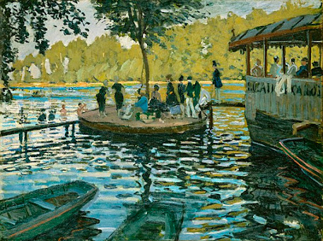
La Grenouillère by Claude Monet La Grenouillère  was painted by Claude Monet and was made in 1896 at a resort on the Seine River near Paris. Monet uses the style impressionism which is shown in the colors, brushworks, light, and reflection. Monet captures the play of light on water, using various shades of blue, green, and white to depict reflections which adds a shimmering effect. Monet uses short, loose brushstrokes to convey a sense of movement and the vanishing nature of light. The reflections in the water show features of boats, people, and foliage creating lively interplay of shapes and colors. This painting gives me emotions of relaxation and peace. The carefree summer day and overall atmosphere captured through the people enjoying a day by the river and the main focus of the vibrant light on water makes me feel calm and at peace. This painting really meets my presentation preference by creating such a happy atmosphere with light and color. I do wish the composition was zoomed

Classical Blog

Image
Marie Antoinette and Her Children by Élisabeth Vigée Le Brun Marie Antoinette and Her Children was painted by Élisabeth Vigée Le Brun in Paris 1787. The painting shows elements of color, lighting, and balance. The color palette used is soft, muted colors to create a sense of elegance and serenity. Red is used in Marie Antionette's gown with sable lining to show she is of wealth. The pastel colors used in the carpet, shows this was painted in central France where workshops produced these carpets for nobilities. The Rococo technique was used in the floral carpet as well, depicting that it is French. The lighting in the painting was carefully placed as it highlights the faces and expressions of Marie and her children, emphasizing their emotional connection to each other. The balance in the composition is a triangular arrangement of the figures. Marie Antoinette is in the center which gives inspiration of traditional paintings or images of the Holy Family, signifying the Queen's ma

Baroque Blog

Image
  The Swing by Jean Honoré Fragonard  The Swing was painted by Jean Honoré Fragonard in France 1767. Jean created The Swing u sing oil paint and the rococo art style. Rococo art style was originated in France in the 1720s but wasn't popular til the 1770s. The rococo style depicts beautiful clothing and natural settings. It also creates an illusion of motion and drama. Using the rococo style, Jean used pastel colors such as pink, greens, and hints of red. The bright  pink of the woman's dress and the accents of crimson red on the swing, stands out against the cooler greens in the garden. This draws the viewer's attention to the woman on the swing, giving the impression she is the main object of the painting. Along with using pastel colors like the rococo style, Jean also used shapes and textures. The woman swinging was painted with curved lines to accentuate her body. Jean also incorporated swirling diagonal textures that helps direct the eye to a certain object and creat

Renaissance Blog

Image
  The Creation of Adam by Michelangelo  The Creation of Adam was created by Michelangelo between 1508 and 1512. It was painted on the ceiling in the Sistine Chapel, Rome during the Italian Renaissance. It is one of Michelangelo's most famous pieces. Michelangelo used the fresco technique on a damp plaster for this piece. The fresco technique allowed Michelangelo to create astonishing details like the faces of the figures. In The Creation of Adam , awe is shown in the art elements through shapes, lines, and colors. Looking at the painting, in the left composition is a shape of a triangle and in the right composition is an oval shape. These shapes could have many meanings, for example, the shape of Adam's body echoes God's, representing that man was created in the image of God. Another example is the oval around the angels and God, this shape could be seen to look a like a placenta, meaning that Adam was born rather than created. The line work is shown by the horizontal line

Art Analysis

Image
  The Cliffs of Étretat By Claude Monet, Normandy 1886      The way you can see how Monet incorporates his pastel palette colors such as pink or green, into the clouds shows reflection off the of the sun located on the other side of the arch. The detailed lined brush strokes gives textures in the cliffs, making it look more realistic. The shadowing brings depth and shaping into the painting as well. Monet has created space by giving the perspective that one object is closer than the other, or in other words overlapping the boulder in the corner to part of the cliff. It captures a great picture of the beautiful seascape or landscape. This specific painting is special because Monet painted it from a secluded spot, you may only reach it by boat or previously known path. This arch was naturally formed and is the main attraction for why many tourists visit Étretat. Monet was so drawn by how astonishing, picturesque, and unique the cliffs along Étretat were, he had created about 50 more pai